Button
The one call to action. Renders a link when it has an href and a real button otherwise. Hover it: the fill rises from below.
Controls
variant
size
icon
Usage
Design system
Catalan for lighthouse, the light that guides, and also a question: how far can you get with little? I like that challenge, and it is how I have always worked, with few resources and a lot of care, making something we can be proud of.
Tokens are the single source of truth (W3C Design Tokens format), compiled to CSS and contrast-checked on every build, so this page can’t drift from what actually ships. Toggle the theme to see every value change, or switch to JSON to see the source itself.
Foundations
A small Mediterranean palette, named after what it actually looks like rather than a numbered grey scale: sand and ink for light and dark text, tide for the deep navy of dark mode, aqua as the one accent, and olive for the rare positive state. Components only ever use semantic roles.
sand
sand.50
#FBFAF8
sand.100
#F6F5F1
sand.200
#EFEDE7
sand.300
#E4E1D9
sand.400
#D2CEC4
ink
ink.300
#8993A3
ink.400
#5F6673
ink.500
#525A67
ink.700
#2A3547
ink.800
#1A2434
ink.900
#0B1320
tide
tide.50
#E8ECF2
tide.200
#9AA5B5
tide.600
#1E2A3C
tide.700
#152033
tide.800
#101827
tide.900
#0B1320
tide.950
#08111F
tide.1000
#060D18
aqua
aqua.300
#4FD6CF
aqua.400
#2FB8B2
aqua.600
#0A7178
aqua.700
#075B61
olive
olive.400
#7FB89A
olive.600
#2F6B4F
{
  "$type": "color",
  "$description": "A small Mediterranean palette, named after what it actually looks like rather than a numbered grey scale: sand, ink, tide, aqua, olive.",
  "sand": {
    "50": {
      "$value": "#FBFAF8"
    },
    "100": {
      "$value": "#F6F5F1"
    },
    "200": {
      "$value": "#EFEDE7"
    },
    "300": {
      "$value": "#E4E1D9"
    },
    "400": {
      "$value": "#D2CEC4"
    }
  },
  "ink": {
    "300": {
      "$value": "#8993A3"
    },
    "400": {
      "$value": "#5F6673"
    },
    "500": {
      "$value": "#525A67"
    },
    "700": {
      "$value": "#2A3547"
    },
    "800": {
      "$value": "#1A2434"
    },
    "900": {
      "$value": "#0B1320"
    }
  },
  "tide": {
    "50": {
      "$value": "#E8ECF2"
    },
    "200": {
      "$value": "#9AA5B5"
    },
    "600": {
      "$value": "#1E2A3C"
    },
    "700": {
      "$value": "#152033"
    },
    "800": {
      "$value": "#101827"
    },
    "900": {
      "$value": "#0B1320"
    },
    "950": {
      "$value": "#08111F"
    },
    "1000": {
      "$value": "#060D18"
    }
  },
  "aqua": {
    "300": {
      "$value": "#4FD6CF"
    },
    "400": {
      "$value": "#2FB8B2"
    },
    "600": {
      "$value": "#0A7178"
    },
    "700": {
      "$value": "#075B61"
    }
  },
  "olive": {
    "400": {
      "$value": "#7FB89A"
    },
    "600": {
      "$value": "#2F6B4F"
    }
  }
}
--color-bg
#F6F5F1#060D18
sand.100tide.1000
--color-bg-subtle
#EFEDE7#0B1320
sand.200tide.900
--color-surface
#FBFAF8#0B1320
sand.50tide.900
--color-surface-raised
#FFFFFF#101827
literaltide.800
--color-text
#0B1320#E8ECF2
ink.900tide.50
--color-text-muted
#525A67#9AA5B5
ink.500tide.200
--color-text-subtle
#5F6673#8993A3
ink.400ink.300
--color-text-inverse
#F6F5F1#08111F
sand.100tide.950
--color-border
#D2CEC4#1E2A3C
sand.400tide.600
--color-border-subtle
#E4E1D9#152033
sand.300tide.700
--color-border-strong
#0B1320#E8ECF2
ink.900tide.50
--color-frame
#FFFFFF#FFFFFF
literalliteral
--color-accent
#0A7178#4FD6CF
aqua.600aqua.300
--color-accent-hover
#075B61#8AEDE6
aqua.700literal
--color-accent-contrast
#FFFFFF#08111F
literaltide.950
--color-positive
#2F6B4F#7FB89A
olive.600olive.400
--color-danger
#B42318#FF8A7A
literalliteral
--color-focus
#0A7178#4FD6CF
aqua.600aqua.300
--color-cursor
#0B1320#E8ECF2
ink.900tide.50
--color-grid-dot
#D2CEC4#1E2A3C
sand.400tide.600
--color-selection
#C9EEEC#0F4A4F
literalliteral
{
  "light": {
    "$type": "color",
    "bg": {
      "$value": "{primitive.color.sand.100}"
    },
    "bg-subtle": {
      "$value": "{primitive.color.sand.200}"
    },
    "surface": {
      "$value": "{primitive.color.sand.50}"
    },
    "surface-raised": {
      "$value": "#FFFFFF"
    },
    "text": {
      "$value": "{primitive.color.ink.900}"
    },
    "text-muted": {
      "$value": "{primitive.color.ink.500}"
    },
    "text-subtle": {
      "$value": "{primitive.color.ink.400}"
    },
    "text-inverse": {
      "$value": "{primitive.color.sand.100}"
    },
    "border": {
      "$value": "{primitive.color.sand.400}"
    },
    "border-subtle": {
      "$value": "{primitive.color.sand.300}"
    },
    "border-strong": {
      "$value": "{primitive.color.ink.900}"
    },
    "frame": {
      "$value": "#FFFFFF",
      "$description": "The page frame: a white mat around everything, as on the previous site."
    },
    "accent": {
      "$value": "{primitive.color.aqua.600}"
    },
    "accent-hover": {
      "$value": "{primitive.color.aqua.700}"
    },
    "accent-contrast": {
      "$value": "#FFFFFF"
    },
    "positive": {
      "$value": "{primitive.color.olive.600}"
    },
    "danger": {
      "$value": "#B42318"
    },
    "focus": {
      "$value": "{primitive.color.aqua.600}"
    },
    "cursor": {
      "$value": "{primitive.color.ink.900}"
    },
    "grid-dot": {
      "$value": "{primitive.color.sand.400}"
    },
    "selection": {
      "$value": "#C9EEEC"
    }
  },
  "dark": {
    "$type": "color",
    "bg": {
      "$value": "{primitive.color.tide.1000}"
    },
    "bg-subtle": {
      "$value": "{primitive.color.tide.900}"
    },
    "surface": {
      "$value": "{primitive.color.tide.900}"
    },
    "surface-raised": {
      "$value": "{primitive.color.tide.800}"
    },
    "text": {
      "$value": "{primitive.color.tide.50}"
    },
    "text-muted": {
      "$value": "{primitive.color.tide.200}"
    },
    "text-subtle": {
      "$value": "{primitive.color.ink.300}"
    },
    "text-inverse": {
      "$value": "{primitive.color.tide.950}"
    },
    "border": {
      "$value": "{primitive.color.tide.600}"
    },
    "border-subtle": {
      "$value": "{primitive.color.tide.700}"
    },
    "border-strong": {
      "$value": "{primitive.color.tide.50}"
    },
    "frame": {
      "$value": "#FFFFFF",
      "$description": "Same pure white in both themes."
    },
    "accent": {
      "$value": "{primitive.color.aqua.300}"
    },
    "accent-hover": {
      "$value": "#8AEDE6"
    },
    "accent-contrast": {
      "$value": "{primitive.color.tide.950}"
    },
    "positive": {
      "$value": "{primitive.color.olive.400}"
    },
    "danger": {
      "$value": "#FF8A7A"
    },
    "focus": {
      "$value": "{primitive.color.aqua.300}"
    },
    "cursor": {
      "$value": "{primitive.color.tide.50}"
    },
    "grid-dot": {
      "$value": "{primitive.color.tide.600}"
    },
    "selection": {
      "$value": "#0F4A4F"
    }
  }
}
Foundations
Aeonik Pro (Regular, Medium and Bold) does the work: geometric, warm, quietly confident. When a word truly needs to stand out, it takes the accent colour instead of a different style, and that stays rare. A fluid scale, so type grows smoothly between mobile and desktop without breakpoints.
Families
Weights
Size
Leading
Tracking
{
  "font": {
    "family": {
      "$type": "fontFamily",
      "sans": {
        "$value": "'Aeonik Pro', ui-sans-serif, system-ui, -apple-system, 'Segoe UI', Helvetica, Arial, sans-serif"
      },
      "mono": {
        "$value": "ui-monospace, 'SF Mono', 'JetBrains Mono', Menlo, monospace"
      }
    },
    "weight": {
      "$type": "fontWeight",
      "regular": {
        "$value": 400
      },
      "medium": {
        "$value": 500
      },
      "bold": {
        "$value": 700
      }
    }
  },
  "size": {
    "$type": "dimension",
    "$description": "Fluid scale (≈ Major Third on mobile → Perfect Fourth on desktop).",
    "xs": {
      "$value": "0.75rem"
    },
    "sm": {
      "$value": "0.875rem"
    },
    "base": {
      "$value": "clamp(1rem, 0.96rem + 0.18vw, 1.125rem)"
    },
    "md": {
      "$value": "clamp(1.125rem, 1.06rem + 0.3vw, 1.3125rem)"
    },
    "lg": {
      "$value": "clamp(1.3125rem, 1.18rem + 0.6vw, 1.75rem)"
    },
    "xl": {
      "$value": "clamp(1.625rem, 1.35rem + 1.2vw, 2.5rem)"
    },
    "2xl": {
      "$value": "clamp(2rem, 1.5rem + 2.2vw, 3.5rem)"
    },
    "3xl": {
      "$value": "clamp(2.5rem, 1.7rem + 3.6vw, 5rem)"
    },
    "display": {
      "$value": "clamp(2.875rem, 1.6rem + 5.6vw, 7.5rem)"
    }
  },
  "leading": {
    "$type": "number",
    "tight": {
      "$value": 1.02
    },
    "snug": {
      "$value": 1.15
    },
    "normal": {
      "$value": 1.5
    },
    "relaxed": {
      "$value": 1.65
    }
  },
  "tracking": {
    "$type": "dimension",
    "tight": {
      "$value": "-0.035em"
    },
    "snug": {
      "$value": "-0.02em"
    },
    "normal": {
      "$value": "0"
    },
    "wide": {
      "$value": "0.08em"
    }
  }
}Calm systems
Systems that last
Small decisions, made once
One source of truth for everything
A design system is a service, not a library.
Tokens are compiled to CSS and contrast-checked on every build.
Tokens are compiled to CSS and contrast-checked on every build, so nothing here can drift from what ships.
Updated on every build
Design system
{
  "$type": "typography",
  "$description": "Text styles. Each one is a ready-made class (.t-*) that combines size, leading, tracking and weight.",
  "display": {
    "$value": {
      "fontSize": "{type.display}",
      "lineHeight": "{leading.tight}",
      "letterSpacing": "{tracking.tight}",
      "fontWeight": "{primitive.font.weight.regular}"
    },
    "$description": "The hero headline",
    "$extensions": {
      "class": "t-display"
    }
  },
  "title": {
    "$value": {
      "fontSize": "{type.3xl}",
      "lineHeight": 1.05,
      "letterSpacing": "{tracking.tight}",
      "fontWeight": "{primitive.font.weight.regular}"
    },
    "$description": "Page titles",
    "$extensions": {
      "class": "t-3xl"
    }
  },
  "heading": {
    "$value": {
      "fontSize": "{type.2xl}",
      "lineHeight": 1.1,
      "letterSpacing": "{tracking.tight}",
      "fontWeight": "{primitive.font.weight.regular}"
    },
    "$description": "Section titles",
    "$extensions": {
      "class": "t-2xl"
    }
  },
  "subheading": {
    "$value": {
      "fontSize": "{type.xl}",
      "lineHeight": "{leading.snug}",
      "letterSpacing": "{tracking.snug}",
      "fontWeight": "{primitive.font.weight.regular}"
    },
    "$description": "Titles inside a section",
    "$extensions": {
      "class": "t-xl"
    }
  },
  "lead": {
    "$value": {
      "fontSize": "{type.lg}",
      "lineHeight": 1.4,
      "letterSpacing": "-0.01em",
      "fontWeight": "{primitive.font.weight.regular}"
    },
    "$description": "Introductions and list titles",
    "$extensions": {
      "class": "t-lg"
    }
  },
  "body-large": {
    "$value": {
      "fontSize": "{type.md}",
      "lineHeight": "{leading.normal}",
      "letterSpacing": "{tracking.normal}",
      "fontWeight": "{primitive.font.weight.regular}"
    },
    "$description": "Larger running text",
    "$extensions": {
      "class": "t-md"
    }
  },
  "body": {
    "$value": {
      "fontSize": "{type.base}",
      "lineHeight": "{leading.relaxed}",
      "letterSpacing": "{tracking.normal}",
      "fontWeight": "{primitive.font.weight.regular}"
    },
    "$description": "Running text, the default",
    "$extensions": {
      "class": "(default)"
    }
  },
  "caption": {
    "$value": {
      "fontSize": "{type.sm}",
      "lineHeight": "{leading.normal}",
      "letterSpacing": "{tracking.normal}",
      "fontWeight": "{primitive.font.weight.regular}"
    },
    "$description": "Captions, interface text and metadata",
    "$extensions": {
      "class": "t-sm"
    }
  },
  "label": {
    "$value": {
      "fontSize": "{type.xs}",
      "lineHeight": "{leading.normal}",
      "letterSpacing": "{tracking.wide}",
      "fontWeight": "{primitive.font.weight.medium}"
    },
    "$description": "Eyebrows and section markers, always uppercase",
    "$extensions": {
      "class": "t-label"
    }
  }
}
Foundations
A 4px base for components; fluid tokens for section and block rhythm. The grid is 4 / 8 / 12 columns with fluid gutters and margins, capped at 1440px.
Breakpoints
{
  "space": {
    "0": {
      "$value": "0"
    },
    "1": {
      "$value": "0.25rem"
    },
    "2": {
      "$value": "0.5rem"
    },
    "3": {
      "$value": "0.75rem"
    },
    "4": {
      "$value": "1rem"
    },
    "5": {
      "$value": "1.5rem"
    },
    "6": {
      "$value": "2rem"
    },
    "7": {
      "$value": "3rem"
    },
    "8": {
      "$value": "4rem"
    },
    "9": {
      "$value": "6rem"
    },
    "10": {
      "$value": "8rem"
    },
    "11": {
      "$value": "12rem"
    }
  },
  "breakpoint": {
    "$type": "dimension",
    "$description": "Reference only — CSS media queries can't read custom properties. Mirror these in @media rules.",
    "sm": {
      "$value": "480px"
    },
    "md": {
      "$value": "768px"
    },
    "lg": {
      "$value": "1024px"
    },
    "xl": {
      "$value": "1280px"
    },
    "2xl": {
      "$value": "1536px"
    }
  }
}Calm systems are quiet on purpose. A line of running text should never run wider than the eye can comfortably follow.
Calm systems are quiet on purpose. A line of running text should never run wider than the eye can comfortably follow.
Calm systems are quiet on purpose. A line of running text should never run wider than the eye can comfortably follow.
12-column grid
{
  "rhythm": {
    "section": {
      "$value": "clamp(4.5rem, 3rem + 5vw, 8.5rem)",
      "$description": "Vertical rhythm between page sections"
    },
    "block": {
      "$value": "clamp(3rem, 2rem + 4vw, 6rem)",
      "$description": "Vertical rhythm between blocks inside a section"
    }
  },
  "layout": {
    "$type": "dimension",
    "max": {
      "$value": "1440px",
      "$description": "Widest the content ever gets"
    },
    "margin": {
      "$value": "clamp(1.25rem, 0.5rem + 3.5vw, 5rem)",
      "$description": "Space between the page edge and the content"
    },
    "gutter": {
      "$value": "clamp(1rem, 0.6rem + 1.4vw, 2rem)",
      "$description": "Space between grid columns"
    },
    "nav-h": {
      "$value": "4.5rem",
      "$description": "Height of the navigation bar"
    }
  },
  "measure": {
    "$type": "dimension",
    "narrow": {
      "$value": "34ch",
      "$description": "Short blocks: captions, pull quotes"
    },
    "body": {
      "$value": "64ch",
      "$description": "Running text; the default reading width"
    },
    "wide": {
      "$value": "80ch",
      "$description": "Long-form and code"
    }
  }
}
Foundations
Mostly square, editorial edges for UI. Photography is the one exception: every image gets a bigger, more modern curve of its own (lg). Pills stay for interactive elements. Depth comes from hairlines first; shadows are reserved for things that float.
Border width
{
  "radius": {
    "$type": "dimension",
    "$description": "Mostly square UI, but photography gets a bigger, more modern curve: lg is for images specifically, not general UI.",
    "none": {
      "$value": "0"
    },
    "xs": {
      "$value": "2px"
    },
    "sm": {
      "$value": "4px"
    },
    "md": {
      "$value": "8px"
    },
    "lg": {
      "$value": "20px"
    },
    "pill": {
      "$value": "999px"
    }
  },
  "border": {
    "$type": "dimension",
    "hairline": {
      "$value": "1px"
    },
    "strong": {
      "$value": "1.5px"
    },
    "focus": {
      "$value": "2px"
    }
  },
  "elevation": {
    "0": {
      "$value": "none"
    },
    "1": {
      "$value": "0 1px 2px rgb(11 19 32 / 0.06), 0 2px 8px rgb(11 19 32 / 0.04)"
    },
    "2": {
      "$value": "0 8px 24px rgb(11 19 32 / 0.08), 0 2px 6px rgb(11 19 32 / 0.05)"
    },
    "3": {
      "$value": "0 24px 64px rgb(11 19 32 / 0.14), 0 6px 16px rgb(11 19 32 / 0.06)"
    },
    "$type": "shadow"
  }
}{
"$description": "Which radius, border and shadow to reach for, by job.",
"media": {
"$type": "dimension",
"$value": "{radius.lg}",
"$description": "Images, project tiles, callouts and video previews"
},
"control": {
"$type": "dimension",
"$value": "{radius.pill}",
"$description": "Anything you press: buttons, toggles, tags"
},
"field": {
"$type": "dimension",
"$value": "{radius.sm}",
"$description": "Inputs, code blocks and the password gate"
},
"inline": {
"$type": "dimension",
"$value": "{radius.xs}",
"$description": "Small marks and focus corners"
},
"divider": {
"$type": "dimension",
"$value": "{border.hairline}",
"$description": "Every rule and outline: lists, cards, fields"
},
"focus-ring": {
"$type": "dimension",
"$value": "{border.focus}",
"$description": "The keyboard focus outline"
},
"raised": {
"$type": "shadow",
"$value": "{elevation.1}",
"$description": "A control that sits above its track, like a toggle thumb"
},
"floating": {
"$type": "shadow",
"$value": "{elevation.2}",
"$description": "Cards that float over a surface"
},
"overlay": {
"$type": "shadow",
"$value": "{elevation.3}",
"$description": "Previews and dialogs above the page"
}
}Foundations
Four curves, hand-tuned rather than pulled from a framework, each with one job. Movement explains, never decorates, and collapses to instant under prefers-reduced-motion. Hover a row to play it.
{
  "duration": {
    "$type": "duration",
    "$description": "Named for how long they feel, not what they're for. Reused across the site by feel, not by component.",
    "blink": {
      "$value": "80ms"
    },
    "quick": {
      "$value": "160ms"
    },
    "easy": {
      "$value": "280ms"
    },
    "unhurried": {
      "$value": "560ms"
    },
    "patient": {
      "$value": "900ms"
    }
  },
  "ease": {
    "$type": "cubicBezier",
    "$description": "Four hand-tuned curves, not the stock Material/CSS ones. Named by what they do rather than a spec keyword.",
    "steady": {
      "$value": [
        0.22,
        0.04,
        0.03,
        1
      ],
      "$description": "The default. Even-handed, for ordinary state changes: hover, colour, border."
    },
    "float": {
      "$value": [
        0.14,
        0.8,
        0.24,
        1
      ],
      "$description": "Slow to start, gentle landing. For things arriving: reveals, headlines, dialogs."
    },
    "drop": {
      "$value": [
        0.36,
        0.02,
        0.94,
        0.06
      ],
      "$description": "Leaves fast and doesn't look back. For things dismissed or scrolled past."
    },
    "pivot": {
      "$value": [
        0.62,
        0.04,
        0.32,
        1
      ],
      "$description": "A short pause, then commits. For things that swing between two states: the theme switch, a toggle."
    }
  }
}{
"$type": "transition",
"$description": "Which duration and curve to reach for, by job. Movement explains, never decorates.",
"feedback": {
"$value": {
"duration": "{motion.duration.easy}",
"timingFunction": "{motion.ease.steady}"
},
"$description": "Hover, colour and border changes: the everyday state change"
},
"move": {
"$value": {
"duration": "{motion.duration.unhurried}",
"timingFunction": "{motion.ease.float}"
},
"$description": "Things that move or arrive: lifts, image zoom, underlines drawing"
},
"reveal": {
"$value": {
"duration": "{motion.duration.patient}",
"timingFunction": "{motion.ease.float}"
},
"$description": "Scroll reveals and headlines entering the page"
},
"toggle": {
"$value": {
"duration": "{motion.duration.easy}",
"timingFunction": "{motion.ease.pivot}"
},
"$description": "Switches that swing between two states, like a toggle thumb"
}
}Components
The one call to action. Renders a link when it has an href and a real button otherwise. Hover it: the fill rises from below.
Controls
Usage
Inline links live inside running text with a hairline underline that draws in on hover. The standalone one adds an arrow and a 44px target.
Every project has a Read the case study link, and it only draws its line when you ask.
Every project has a Read the case study(opens in a new tab) link, and it only draws its line when you ask.
Controls
Usage
Three items and the theme switch, at every width. On the real page it follows your scroll and tucks away; here it is pinned so you can see it.
Controls
Usage
What you are using right now. A real tablist with roving focus: try the arrow keys, Home and End.
Overview. One panel at a time, so a long page never becomes one long scroll.
Usage. Pass the tabs and give each section a matching data-panel.
Accessibility. Plain anchors until the script upgrades them to a real tablist.
Controls
Usage
A two-way switch that sets data-view on a target and remembers your choice. Text labels or icons.
data-view =
data-view =
Controls
Usage
Any JSON value with light highlighting and a copy button. The text is real and selectable.
{
  "space": {
    "4": {
      "$value": "1rem"
    },
    "5": {
      "$value": "1.5rem"
    }
  }
}{
"name": "Button",
"variants": "primary · secondary · ghost · sizes md (44px) · lg (56px)",
"states": "default · hover (fill rises) · focus-visible · active (scale .98) · disabled",
"a11y": "Renders <a> when it has href, otherwise <button type=\"button\">. 44px minimum target. External links announce “opens in a new tab”."
}Controls
Usage
The whole tile is one link, only the title is announced. Hover for the image zoom, the title line and the cursor label.
Relaunching Mango’s design system: from a forgotten component library to a trusted bridge between design and engineering.
Relaunching Mango’s design system: from a forgotten component library to a trusted bridge between design and engineering.
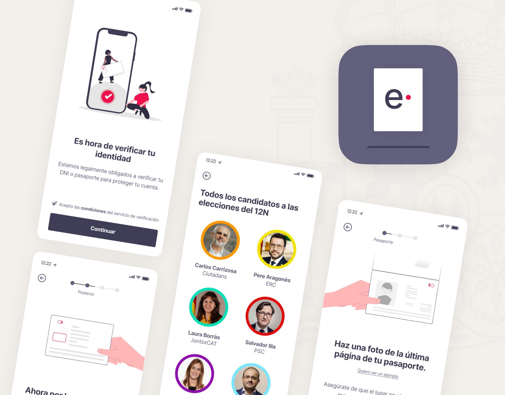
A concept app to vote from anywhere: agile, comfortable and secure, with an accent colour chosen at random to stay impartial.
A concept app to vote from anywhere: agile, comfortable and secure, with an accent colour chosen at random to stay impartial.
A playful swipe game that taught the recommendation engine what customers don’t like: the first gamified experience in the Mango app.
A playful swipe game that taught the recommendation engine what customers don’t like: the first gamified experience in the Mango app.
Controls
Usage
Just a title and its content, with no box around it. An optional index number, and a heading level to keep the outline correct.
Somebody has to answer “is this the right blue?” at 4pm on a Friday. That’s the job.
Somebody has to answer “is this the right blue?” at 4pm on a Friday. That’s the job.
01
Somebody has to answer “is this the right blue?” at 4pm on a Friday. That’s the job.
01
Somebody has to answer “is this the right blue?” at 4pm on a Friday. That’s the job.
Controls
Usage
A schematic of the page: fixed section order, an optional cover, metrics and links, and a table of contents that follows you down.
Controls
Usage
Every photo goes through here: AVIF and WebP at several sizes, lazy by default, always with alt text.
Controls
Usage
A dot and a ring that follow a mouse, and change with what is under them. Move over each area. It only exists for fine pointers and never with reduced motion.
Nothing to act on: the small ring.
Anything you can press: the ring grows.
ViewPreviews carry a small label.
Controls
Usage
Dark by default, light on request, remembered for next time. The change wipes across the page in a circle.
Controls
Usage
A visible label, an optional hint, and an error that says what to do, always with words rather than colour alone.
Please enter a name.
Please enter a name.
The name on your business card.
The name on your business card.
The name on your business card.
Please enter a name.
The name on your business card.
Please enter a name.
Controls
Usage
What stands in front of a case study’s confidential half. This one is a demo: any password shows the error, nothing ever unlocks.
This case study includes confidential details
The summary and results above are public. The rest, how the project actually worked, is shared under a password because it covers information Mango hasn’t made public. If you’re a recruiter or hiring manager and don’t have it, get in touch and I’ll send it over.
Controls
Usage
Version, links elsewhere and the colophon. One layout, quiet on purpose.
Usage
A small set drawn on a 20px grid with a 1.5px stroke, so they match the type. They inherit the colour of the text around them.
Controls
Usage
Specification
| Component | Variants | States & interaction | Accessibility |
|---|---|---|---|
| Button | primary · secondary · ghost · sizes md (44px) · lg (56px) | default · hover (fill rises) · focus-visible · active (scale .98) · disabled | Renders <a> when it has href, otherwise <button type="button">. 44px minimum target. External links announce “opens in a new tab”. |
| Link | inline · standalone (with arrow, 44px target) | default (hairline) · hover (line draws in) · focus-visible | Underline is never removed; colour is not the only cue. External links detected automatically. |
| Navigation | single variant: three items, no hamburger needed at any width | default · scrolled (hairline) · hidden on scroll down · current page (aria-current) | <nav aria-label="Main">, reappears whenever focus enters it, skip link before it. |
| Section tabs | link list (no JS) · full ARIA tablist (enhanced) | selected (underline slides) · hover · focus-visible, arrow/home/end keys move between tabs | Plain anchors until JS upgrades them, so every section stays reachable either way. Selection is shareable as a #hash. |
| View toggle | Visual · JSON, two-way switch | checked/unchecked (thumb slides), remembers the last choice | role="radiogroup" of two role="radio" buttons; the choice is announced, not just shown by colour. |
| Code block | any JSON value, with a copy button | default · copied (label swaps, doesn’t rely on colour alone) | Real, selectable text: highlighting is decorative spans, not images. Scrolls independently on long values. |
| Project tile | feature (16:10, full width) · default (4:3, half) | default · hover (image 1.03, title underline, “View case” cursor) · focus-visible (ring around tile) | Stretched-link pattern: the whole tile is clickable but only the title is announced. Real heading level per context. |
| Card | with index · without index | default only: no box, no hover, quiet by design | Static content; heading level configurable (h3/h4) to keep the outline correct. |
| Case study layout | image cover · coded visual cover, optional metrics and links | TOC highlights the section in view | Fixed section order, H1 → H2 outline, TOC is a labelled <nav> with aria-current="location". |
| Image / Figure | full · wide · inset · cover or contain · optional parallax | lazy by default, eager + high priority for the first image | alt is required (empty only when decorative). AVIF/WebP with responsive sizes. |
| Cursor | dot + ring, states default · link · view (with label) · text · pressed | Only on fine pointers, without reduced motion, outside forced colours | Purely decorative (aria-hidden). Native cursor returns automatically whenever it is inactive. |
| Theme switch | icon button | light · dark (follows system until chosen), circular wipe transition | aria-label names the theme it switches to. Preference stored locally; no flash on load. |
| Input | default · with hint · with error · disabled | default · hover · focus-visible (ring) · invalid | Visible <label>, hint and error linked with aria-describedby, aria-invalid on error. Error uses icon + text, not colour alone. |
| Protected gate | sits in front of a case study’s detailed body | locked → checking → error → unlocked (the derived key lasts for the tab’s session) | Password field has a real <label>; the error is announced with role="alert". The body is encrypted (AES-256-GCM), not just hidden. |
| Footer | single layout: version, links elsewhere, colophon | links: default · hover (line draws in) · focus-visible | Plain landmark with real links. The link to this page is underlined, so colour is never the only cue. |
[
{
  "name": "Button",
  "variants": "primary · secondary · ghost · sizes md (44px) · lg (56px)",
  "states": "default · hover (fill rises) · focus-visible · active (scale .98) · disabled",
  "a11y": "Renders <a> when it has href, otherwise <button type=\"button\">. 44px minimum target. External links announce “opens in a new tab”."
},
{
"name": "Link",
"variants": "inline · standalone (with arrow, 44px target)",
"states": "default (hairline) · hover (line draws in) · focus-visible",
"a11y": "Underline is never removed; colour is not the only cue. External links detected automatically."
},
{
"name": "Navigation",
"variants": "single variant: three items, no hamburger needed at any width",
"states": "default · scrolled (hairline) · hidden on scroll down · current page (aria-current)",
"a11y": "<nav aria-label=\"Main\">, reappears whenever focus enters it, skip link before it."
},
{
"name": "Section tabs",
"variants": "link list (no JS) · full ARIA tablist (enhanced)",
"states": "selected (underline slides) · hover · focus-visible, arrow/home/end keys move between tabs",
"a11y": "Plain anchors until JS upgrades them, so every section stays reachable either way. Selection is shareable as a #hash."
},
{
"name": "View toggle",
"variants": "Visual · JSON, two-way switch",
"states": "checked/unchecked (thumb slides), remembers the last choice",
"a11y": "role=\"radiogroup\" of two role=\"radio\" buttons; the choice is announced, not just shown by colour."
},
{
"name": "Code block",
"variants": "any JSON value, with a copy button",
"states": "default · copied (label swaps, doesn’t rely on colour alone)",
"a11y": "Real, selectable text: highlighting is decorative spans, not images. Scrolls independently on long values."
},
{
"name": "Project tile",
"variants": "feature (16:10, full width) · default (4:3, half)",
"states": "default · hover (image 1.03, title underline, “View case” cursor) · focus-visible (ring around tile)",
"a11y": "Stretched-link pattern: the whole tile is clickable but only the title is announced. Real heading level per context."
},
{
"name": "Card",
"variants": "with index · without index",
"states": "default only: no box, no hover, quiet by design",
"a11y": "Static content; heading level configurable (h3/h4) to keep the outline correct."
},
{
"name": "Case study layout",
"variants": "image cover · coded visual cover, optional metrics and links",
"states": "TOC highlights the section in view",
"a11y": "Fixed section order, H1 → H2 outline, TOC is a labelled <nav> with aria-current=\"location\"."
},
{
"name": "Image / Figure",
"variants": "full · wide · inset · cover or contain · optional parallax",
"states": "lazy by default, eager + high priority for the first image",
"a11y": "alt is required (empty only when decorative). AVIF/WebP with responsive sizes."
},
{
"name": "Cursor",
"variants": "dot + ring, states default · link · view (with label) · text · pressed",
"states": "Only on fine pointers, without reduced motion, outside forced colours",
"a11y": "Purely decorative (aria-hidden). Native cursor returns automatically whenever it is inactive."
},
{
"name": "Theme switch",
"variants": "icon button",
"states": "light · dark (follows system until chosen), circular wipe transition",
"a11y": "aria-label names the theme it switches to. Preference stored locally; no flash on load."
},
{
"name": "Input",
"variants": "default · with hint · with error · disabled",
"states": "default · hover · focus-visible (ring) · invalid",
"a11y": "Visible <label>, hint and error linked with aria-describedby, aria-invalid on error. Error uses icon + text, not colour alone."
},
{
"name": "Protected gate",
"variants": "sits in front of a case study’s detailed body",
"states": "locked → checking → error → unlocked (the derived key lasts for the tab’s session)",
"a11y": "Password field has a real <label>; the error is announced with role=\"alert\". The body is encrypted (AES-256-GCM), not just hidden."
},
{
"name": "Footer",
"variants": "single layout: version, links elsewhere, colophon",
"states": "links: default · hover (line draws in) · focus-visible",
"a11y": "Plain landmark with real links. The link to this page is underlined, so colour is never the only cue."
}
]